
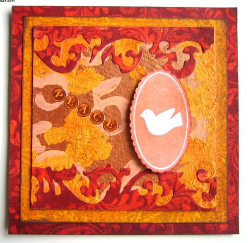
I have been following the Wednesday Stamper blog and think that this piece matches the theme of 'Orange' for this week.
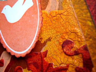
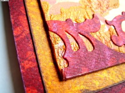
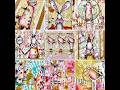
I made a double matted plaque with a central plate made of chipboard. The central plate was cut to 4 x 4 inches and prepared by painting with Lumiere burnt orange paint. When dry the background was stamped randomly with numbers from a foam stamp set from Making Memories using orange acrylic paint. Next fairly thick uneven splodges of spiced marmalade Distress crackle paint was added and allowd to dry. This was then brushed over with some spiced marmalade Distress re-inker to highlight the cracks.

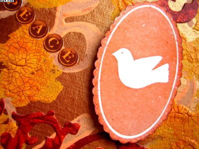
Next I stamped the dove plate ( clear polymer) in pumpkin pigment ink and heat embossed with detail clear embossing powder. This was cut out and edged with dark brown chalk ink.
I used a Sizzix Tim Holtz 'On The Edge' die to cut out the swirls from patterned cardstock, using both the negative and positives top and bottom. They were adhered with glossy accents.
The two printed cardstock mats were cut to 4.5 x 4.5 & 5 x 5 inches. They were matted with glue stick as shown and edged with dark brown chalk ink.
Finally the dove plate was added on foam pads as shown and some self adhesive typewriter key letters added to spell out the word 'Peace'
Very rich colours were achieved and the background sort of 'evolved' as I decided to add the layers. Quite pleased with the way it turned out.
Sid xx
Pin It


Fantastic piece! Love those crackles!
ReplyDeleteGorgeous Project,
ReplyDeletelove those crakles too!
This is lovely Sid, very orangey!!!
ReplyDeleteFabulous colour and texture.. so rich... love it!
ReplyDeleteI agree with Femmy - this is very rich in colour. Love how you have used all the different products too.,
ReplyDeleteVery Orangery.....:) great choice of colors and variety of textures......
ReplyDeletethanks
Absolutely gorgeous
ReplyDeletegorgeous, love the colours
ReplyDeletexx
Gorgeous...I love the colors. Deep and rich and so many elements. You never cease to amaze me.
ReplyDeleteORANGE for sure; and beautiful. Love all the colors you used. They work together beautifully!
ReplyDeleteBeautiful! Vibrant and textured.
ReplyDeleteLove the hot colours and the use of both the positive and negative die cut pieces, looks fab!
ReplyDeleteLove it, the colours, the LO, the cracle paint, just love it.
ReplyDelete