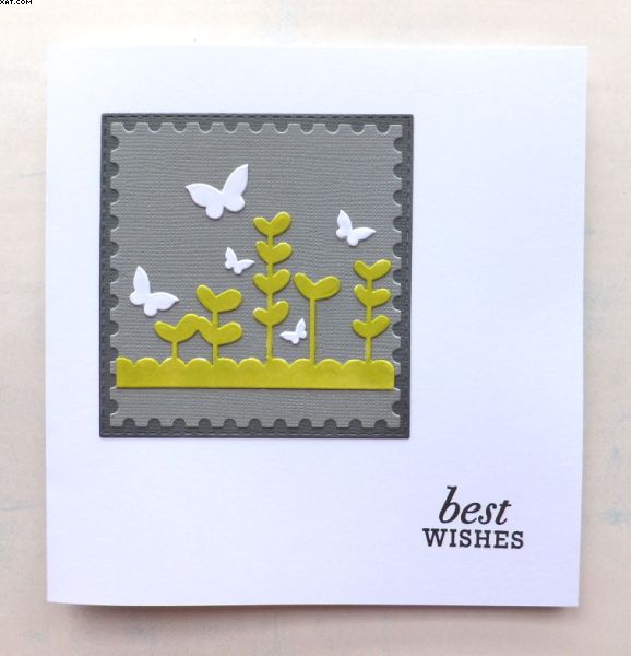
This card has been made for the Less is More challenge blog for week 283 whose theme is 'Colours of your Kitchen'.
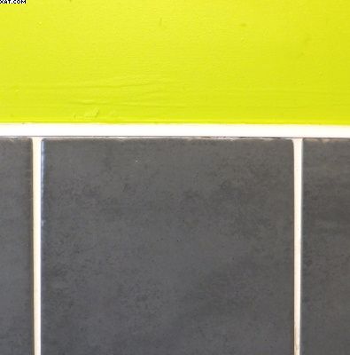
I had a good look at my kitchen and the main colours are Lime Green, Dark and Light Grey & White as depicted in this photo of walls and tiles.
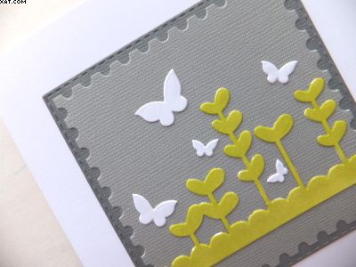
I started with a 5 x 5 inch white square card blank. I then used the Sizzix Bigshot to cut a postage stamp edged die in pale grey textured card. This was matted onto another slightly larger diecut square of dark grey card with a stitched edge die.
I then took a leaf, flower and butterfly die and cut this from white card, trimmed the base to fit the smaller matt and coloured this with a lime green alcohol brush marker sticking in place as shown. The butterflies (in three sizes) were left white and positioned as shown before sticking in place.
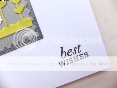
The sentiment is a stamp from Papertrey Ink which was inked in black Versafine ink and stamped directly on the card blank.
Think I got the colours right and I do like my kitchen colours, they are bright but with a nice contrast.
Sid xx Pin It


.png)


Super card and a truly fab colour combo! I love the layout, so classy, and the leaf die has a very pleasing contemporary feel to it with the rounded leaf shapes. Great to see you at LIM :)
ReplyDeleteSid this is fantastic, a classy and elegant colour combo and great representation of your kitchen. It sounds super fun and funky. Thanks for playing along with us at Less is More this week. Sarah
ReplyDeleteWhat a fabulous card, love the layout and the colours are spot on. Beautiful CAS card.
ReplyDeletesuper gorgeous card
ReplyDeleteNice kitchen colours and a great take on the challenge - beautifully CAS.
ReplyDeleteTerrific kitchen colour scheme, looks fab on your card as well.
ReplyDeleteOooh lovely xx
ReplyDeleteGreat colours :)! And so strictly cas; well done!
ReplyDeleteGreat use of some interesting colours to make a dramatic card Sid.
ReplyDeleteBlessings
Maxine
Love the colours and the card is gorgeous.
ReplyDeleteA like the colour combination Sid . A lovely card Clean & simple .
ReplyDeleteGreat choice of colours for your kitchen! They are equally effective as a colour combination on your beautifully designed card.
ReplyDeleteGorgeous kitchen colours Sid, and a gorgeous card too.
ReplyDeleteHugs and thanks for visiting me
Neet xx
Love your beauutiful card Sid and such lovely colours! xx
ReplyDeleteJust playing catch up on last week's challenge entries!
ReplyDeleteSid, this is just terrific, I love the clean lines and simplicity of it!
Thanks so much
Chrissie
"Less is More"
Great card and colours too Sid ;) Viv
ReplyDeleteFabulous colour combo, Sid and I love the layered die cuts. Super design.
ReplyDeleteThanks for sharing with us.
Anita x
Less is More
Love the simplicity of this and yours colour make a fab card! Cara x
ReplyDeleteCan't go wrong with Lime green, in my book! Love it!
ReplyDelete