Monday, June 26, 2006

Captured in Crystal

Recently I have done some work using this technique, and thanks must go to a number of very experienced members of a couple of forums who have contributed their tips, techniques and experiences. The forums are: www.talkcrafts.co.uk & www.ukstampers.co.uk .

There are a few schools of thought about the technique and the resultant pieces of work can vary considerably dependent on how it is done.

The effect is achieved by applying acrylic floor finish to acetate. Layering this with tissue paper with the addition of coloured inks and glitter/pearl powders. The number of layers depend on the effect that you wish to achieve. Finally the front of the acetate can be stamped with a stamp of your choice and Stazon Ink.

Briefly the medium to use is 'Klear' floor finish made by Johnson Wax. Yes, it seems weird but that is what you need to use. It comes in a 500ml bottle which goes quite a way (and you can also use it on floors too !!!!).

Materials required:

Acetate
Masking tape
'Klear' floor finish
White tissue paper
Glitters & Pearl powder
Wide soft brush
Alcohol Inks or Dye Ink re-inkers
Stamps and Stazon pads


  1. Start by taking a piece of acetate, A5 size is most workable but you can use A4 if you like. Using the masking tape seal around the edges of the acetate to securely attach it to a piece of scrap paper/card (some use an old telephone directory - tearing off a few sheets after use). It is important that you completely seal the acetate against this surface because you don't want any of the 'Klear' to run under and onto the front of the acetate.

  1. Then apply by brush (or just pour using the lid off the 'Klear') a small puddle of clear onto the acetate and spread this all over and up to the edge of the masking tape. Now at this stage you can add a sprinkling of glitter or pearl powder, but be sparing with it. It is also possible to add these extras after the first tissue has been placed.
  2. Next cut a piece of white tissue paper slightly larger than your acetate and crumple it up into a ball. Carefully unfold the tissue and place this on top of the wetted acetate and glitter. Add some more 'Klear' and ensure that the bubbles are brushed out from under the tissue. Do this carefully or you may tear the tissue. If you do then patch the hole with a small piece of tissue and 'Klear'. The idea is to leave the wrinkles in the tissue but remove the air bubbles.
  3. Now add your coloured ink by dripping onto the wet surface and finally blending the edges of the colour drops with a brush. Be careful not to overwork as the colour will become muddy. You can also add a little more 'Klear' to assist with this.
  4. Add more layers of tissue and colour if you wish. I find that a few layers with very light colours give the best effect.
  5. Finally allow to air dry. Time for this depends on ambient conditions but usually around 30 minutes

Some like to apply heat from a heat gun to speed up the drying process, but in my experience this can effect the acetate and also crystallise the finish which will then separate from the acetate and ruin the effect.

When completely dry carefully cut around the inner edge of the masking tape with scissors or a craft knife and remove the acetate. You should then see your finished effect in all its glory. The right side is the shiny side of the acetate.

The A5 piece can then be stamped on its front surface with any colour Stazon with the stamp of your choice. This also allows you to choose the bit of the background pattern which appeals to you. Some say that you should stamp the acetate before you attach it at step 1, but I think this then limits your choice of where to stamp against the coloured effect. This can then be cut out from the A5 sheet and the rest saved for future use.

If you spill 'Klear' or allow it to dry on a surface it can be difficult to remove. Recommended method is to use dilute household ammonia and soak it for a minute or two. This will dissolve the acrylic and allow its safe removal. You may also smell ammonia when you use the 'Klear' as it is a component of the finish.

The following pics are of a few effects I have achieved. Nice to use on aperture cards or against a metallic background. These pics have been taken against a white background in each case.

some stamping has been done on this one.

Good luck with the technique. Please let me know how you go on or forward your tips on the technique. Happy Crafting !!!

Sunday, June 25, 2006

More ATC's


Did a little crafting last night and finished off 4 more ATC's. Hope you like them.

The top left- 'SERENITY' is a stamped and heat embossed image (Kodomo) + Adirondack Espresso on white satin card. Background tinted with water colourwash and 'chalk' inkpads. Embellished with a sizzix die-cut dragonfly which has been coated with mauve metallic Inkabilities, wired with a turquoise bead and navy wire. Dotted on bamboo with Pea Green Appli Glue. Bordered with Gold Krylon pen.

Top Right- 'NEWSGIRL' is a background of adhesive tape transferred newsprint with a cut out stamped image using black Stazon. Overstamped with two 'No 7' (Ma Vincis Reliquary) stamps in blue Stazon. Bordered with Gold Krylon pen.

Bottom Left-'ADORATION' is on a background of copper metallic and blackberry spray inks with a blue colourwashed background and stamped image (blue Stazon). No.7 stamp also in Blue Stazon with stamped, coloured and applied photo of lovers with a pastel pink heart brad. The Adore words are in red 'chalk' Ink. Bordered with Gold Krylon pen.

Bottom Right-'DRAGONFLOWER' is on pink mirri-board with a parchment narcissus stamped with versamark ink and heat embossed with eggplant Adirondack embossing powder. The stem is green permanent marker. The Dragonfly is die-cut with sizzix out of black card which has been pre sprayed with pink and blue interference inks. Togetherness stamped with blue stazon ink.

Happy Stamping !

Saturday, June 24, 2006

Faux Dichroic Glass (Part 2)

Welcome back & now to the really interesting part.

Firstly I would like to enlighten you with the method used for colouring your UTEE.

Materials:

Alcohol inks (various colours)
Blending solution (Ranger)
Clear UTEE
Mixing Pots (used yoghurt pots or plastic cups)
Wooden sticks (lolly sticks or stainless steel spatula)

In fact this is achieved by using alcohol inks which are incorporated into small batches of clear UTEE to give you a colour pallette. This really reduces the need for purchasing coloured UTEE (I think the only available brand is Rangers Suze Weinberg). I have used both Ranger and Letraset Tria inks for the colouring. The Tria inks come in Pantone colours if you want to be really accurate with colourways and the Ranger in a series of 24 good colours. Main difference is that the Ranger inks come in a 25ml bottle whilst the Tria in a 40ml bottle. I made a series of colour swatches of the Ranger inks by cutting gloss cardstock into 2cm x 3.5cm strips and adding 4 drops of Ranger Alcohol Blending Solution with 2 drops of coloured ink and drying with a gentle heat from a heat gun. I arranged the finished swatches in colour groups and using a brad fixed them together. This made it easy to select my colour pallette.


Take a small quantity (30gms) of clear UTEE and transfer to one of the mixing pots. Into this squirt the colour ink of your choice (around 5ml). Stir well with the lolly stick and the ink will disperse into the UTEE. Once the UTEE is free flowing as you stir, the colouring has been completed. It is by trial that you will reach the correct intensity of colour - if you think the colour is not strong enough, add some more ink and stir as before. Once you are happy with the colour transfer the coloured UTEE into a storage container. I use a craft mates storage system but you could use any sealable container to store your collection of colours. It is a bit laborious to make the coloured UTEE but it's all worth it in the end !

To be honest you will not use much of this coloured UTEE in comparison to the clear UTEE needed when we get onto the method, but it is essential to use it.

See Part 3 for method and variations

ATC's series 'FREEDOM' - Part 2

Another 2 in the series of 6.

Number 3 again has a background using airbrush and stencil in blues, mauves, pinks and green with some stamping using 'chalk' inkpads in red. The letters in green have been highlighted using Diamond Glaze and a home made embelishment with bedazzles embedded completes the look. Bordered with gold Krylon Pen.

Number 4 has an airbrush and stencil background in reds, greens and mauves with stamped words using a purple 'chalk' inkpad. Some words have been highlighted with Diamond Glaze also. Bordered with Gold Krylon Pen.

Quite pleased with the finished effect. Just 2 more to complete. My next series is entitled 'FRUIT'.

Tuesday, June 20, 2006

Faux Dichroic Glass (Part 1)

I am sure that avid crafters will have heard of Tim Holtz, that very talented American who is one of the Ranger Industries designers and senior educators.

He has, in his wisdom, created two DVD's showing his techniques. Firstly 'An Altered Journey' and secondly 'The Journey Continues'. I think that they are really super and contain a plethora of excellent and exciting techniques for the crafter. Of course, they use a lot of Ranger craft products such as 'Distress Inkpads' and Reinkers, Alcohol Inks and Distress Embossing Powders along with Suze Weinbergs Melting Pot and UTEE (Ultra Thick Embossing Enamel). Suffice it to say I know of very few crafters who know and use these products to be dissapointed with their performance when used in their crafting. I will attempt to mention 'alternative' sources for materials where possible.

Tim has pioneered his own individual style of so called 'Altered' Art and it has much appeal in my opinion. He is famous for NOT ever cleaning his stamps after use and, I have heard it said, that he can afford to throw them away after use also. But that is just what I have heard !!!

I would like to talk about my experiences with the producion of 'Faux Dichroic Glass' which is one of the techniques he describes on his second DVD.

I would just like to offer a word of sincere thanks to Kym Bolton of www.stampgalaxy.co.uk who was resourceful and kind enough to take onboard my plea for a supply of seawashed glass which is a prerequisite of producing the Dichroic Glass. I had looked everywhere for a UK supply of this and as far as I could tell from my searches no-one supplied it here. I telephoned her and she said that she would try and arrange to make some for me..........which she did (very rapidly), and then sent some to me free of charge for my opinion. It was really just what the doctor ordered and I set about trying the technique with my own special variants. Since then Kym has included this glass on her website at a very reasonable price. So I hope some of you will experiment and try the technique.

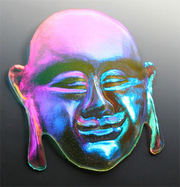
The technique basically is about producing what resembles dichroic glass. For those not sure what that is here is a definition: Dichroic glass is beautiful sparkly glass that was originally developed for the aeronautics industry. It must be manufactured in a vacuum chamber where an electron beam deposits many microscopic layers of metallic oxides, such as magnesium and titanium, on glass. This metallic coating absorbs and reflects different colors of light at different angles, making the glass multi-hued. This example illustrates the effects that can be achieved. This buddha mask shows the effect of the oxides on the surface of the glass.

The faux technique requires that you use seawashed glass which is first coated on one side with a metallic foil using UTEE (ultra thick embossing enamel). This is then covered in coloured UTEE and inclusions, metallic embossing powders etc. added before finishing off with another layer of UTEE. You need to work quickly once started.

Materials required are:

Hot plate or other suitable heat source
Non stick craft sheet (teflon coated oven mat, Lakeland)
Seawashed glass (
www.stampgalaxy.co.uk)
Foil transfer sheet (various metallic colours or multi)
UTEE clear, black & coloured see colouring method in Part 2, (any UTEE)
Alcohol Inks (Letraset Tria)

Metallic embossing powders (silver, copper, gold, interference pearl etc.)
Bedazzles, beads, glitter etc.
Iridescent film (fantasy film, various colours)
Heat resistant spatula and small scoops

I actually bought a melting pot to do the technique and I think it may be very difficult to manage suitably without it,. The problem with other flat heat sources is temperature control, but it might work with a flat electric hob. You will need to experiment.

CARE MUST BE TAKEN AT ALL TIMES NOT TO BURN YOURSELF !

Technique and pictures to follow shortly ! in Part 2

Monday, June 19, 2006

ATC's Series 'FREEDOM'

Well this is one of my attempts at a series of ATC's. I say attempts because I often have the idea and inspiration but when I come to sit down and work on the theme my mind has a habit of going blank. When this happens I usually produce what can only be described as rubbish (but that is in my own opinion). They say that we are our own hardest taskmasters.

I decided on the theme of 'FREEDOM' basically because I felt that it would be possible to depict this in many ways. I suppose freedom to one is not necessarily freedom to someone else and this interested me. I wanted to use words and a wide variety of colours along with trying to use as many different techniques as possible within the size limitations of the card. I have so far produced 2 finished ATC's from a series of 6. I don't think that the photos do them justice but these two were made using stencils and watercolour airbrush for the backgrounds with added embellishments to provide interest and variety.

The first ATC has a colourway of black and ochre with some green. The butterfly wings were stamped in black stazon and cut out and I used some brads (square and dragonfly), along with Diamond Glaze to highlight the letter 'e'. I finally added three flat backed jewels in amber and used a Krylon gold pen to add a border.


The second ATC has a colourway of green, mauve and purple. I used Constantine Stewart Gill Byzantia media and heat embossed this with Stewart Gill Interference Blue embossing powder (along the top 1 cm of the card, can't be seen easily on the shot). I decorated the 'd' with Sakura Gelly Roll glitter pen and the 'o' with Diamond Glaze. I used watercolour pens on the 'm'. Three mauve opalised embellishments were added and printed letters were added using brads. I again used gold Krylon on the border.
Overall I am quite pleased with the effect and hope the other 4 turn out as well !!!